North & South Dakota Population Change
Wednesday, April 12, 2017
Tuesday, April 4, 2017
Lab 8 Data Classification and Map Production
During the classification process and selection, quantile with 10 classes was chosen at first because it placed an equal number of values in each class, which distributes the population change in a better manage. Natural breaks was not possible because the data did not really have strong break points due to missing data from the early 20th century. Due to the high values being negative resulted in a biased map when the equal interval was attempted with low and high number of classes. Equal interval would portray a red counties when they had positive data values. Quantiles assured that each class would have equal values and increasing the number of classes provided more distribution of the negative values without creating a biased map for example a region heavily red because of counties grouped together based off of negative values only rather than dividing it further to portray a truthful result.

The colors for the maps were chosen based off what was being presented and the ability to comprehend.
Colors Ramp Selection
Graduated Colors - red to green color ramp was chosen for these maps because the percent change for some decades have negative values and the red hue helps identify the counties with a negative value. As the color ramp transitions from red to yellow to green it represents growth in population, which can be easily understood by map viewers.

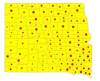
Graduated Symbols - A yellow hue was selected for the counties in North and South Dakota with red graduated sphere symbols. The red stands out and triggers the eye to examine the symbol. While examining the symbol the map viewer can see the changes the map is presenting.
Proportional - A steel blue was chosen for the counties while a tourmaline green was chosen for the symbols because the green color portrays the size of symbols clearly in the midst of the steel blue background. The blue background really shows the outline of each county and the green helps proportionally with the size of the symbol.
 Dot Density - A dark blue was selected as the background in order to use yellow for the dots representing a value per dot. Yellow was chosen because having the dots around one another or far away presented in yellow mimics the view of lights seen from space down on Earth. The dots are better understood when seen as groups of yellow dots on a dark background and visualized as population density much like populated areas with lights on Earth.

After going back to reclassify the breaks the higher the classes the better the chloropleth map it will be, but higher classes will not be as productive with graduated symbols, dot density or proportional symbols. After playing with the the classes and setting ranges manually the best way to portray the classes and breaks is 5 classes through a manual classification to represent percent change. As for the graduated symbols, proportional and dot density maps true values were used therefore 5 classes were still used, but with a different set of ranges.
The colors for the maps were chosen based off what was being presented and the ability to comprehend.
Colors Ramp Selection
Graduated Colors - red to green color ramp was chosen for these maps because the percent change for some decades have negative values and the red hue helps identify the counties with a negative value. As the color ramp transitions from red to yellow to green it represents growth in population, which can be easily understood by map viewers.

Graduated Symbols - A yellow hue was selected for the counties in North and South Dakota with red graduated sphere symbols. The red stands out and triggers the eye to examine the symbol. While examining the symbol the map viewer can see the changes the map is presenting.
Proportional - A steel blue was chosen for the counties while a tourmaline green was chosen for the symbols because the green color portrays the size of symbols clearly in the midst of the steel blue background. The blue background really shows the outline of each county and the green helps proportionally with the size of the symbol.
 Dot Density - A dark blue was selected as the background in order to use yellow for the dots representing a value per dot. Yellow was chosen because having the dots around one another or far away presented in yellow mimics the view of lights seen from space down on Earth. The dots are better understood when seen as groups of yellow dots on a dark background and visualized as population density much like populated areas with lights on Earth.
Monday, March 20, 2017
Lab 7
LAB 7 Joining Data with North & South Dakota
The map below is a representation of US counties with study areas of North and South Dakota along with three other states chosen as a shape file process in Esri.
The projection chosen for this map is the NAD 1983 State
Plane for North Dakota because the coordinate system is designed for the
specific region of North Dakota. North and South Dakota are longer in the east
west direction therefore the Lambert Conformal Conic was used.
A .xls file is a file extension for a
spreadsheet file format created by Microsoft for use with Microsoft
Excel.
Selecting by attribute
is selecting geographic features in GIS, which contains non-spatial information
that is usually stored in a table and linked to the feature by a unique
identifier.
A field is a
column in a table that stores the values for a single attribute.
A record is a set of
related data fields, often a row in a database, containing all the attribute
values for a single feature.
An attribute is
non-spatial information about a geographic feature in a GIS, usually stored in a
table and linked to the feature by a unique identifier.
A relational Database
is a data structure in which collections of tables are logically associated
with each other by shared fields.
The field calculator allows you to calculate area, length, perimeter, and
other geometric properties on fields
in attribute tables.
Monday, March 6, 2017
Lab 6 Introduction to ArcGIS
Boston Area Zip Codes and Highway
The map document is a representation of Massachusetts interstate highways and the zip codes they run through in the Boston area. The table of contents in ArcGIS is a tabbed list of data frames and layers on a map that shows how the data is symbolized, the source of the data, along with whether or not each layer is selective.
A data frame is a map element that defines the page extent, the geographic extent and other properties that consist of layers in the table of contents. A data-set can be represented in one or more data frames as well.
A map layer are groups of point, line, or polygon features representing a particular class or type of real-world entities such as population, roads, or postal codes. A layer contains the visual representation of each feature.
An attribute table is a data-set containing information about geographic features, usually arranged so that each row represents a feature and each column represents one feature attribute.
Black Communities in Boston Area
The map above is a representation of the black communities in the Boston area where graduated symbols represent the density of the back population.
Some issues that I explored on the Esri site are slow performance and after adding several data-sets to an ArcMap Data Frame, features in some layers do not align correctly with other layers. I have experienced the both issues addressed on the site as many others and it converts an easy task to a difficult one.
Lab 6 World Map
World Map

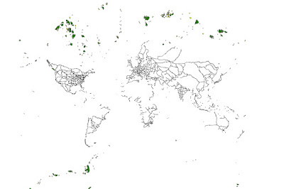
The world map can be seen in other ways such as railroads and islands. The attributes in this world map are major railroads in the world, which outline the shape of the continent. The median and large islands help portray Greenland and and parts of Alaska as well. the world can be seen from a different perspective and yet be identified.
Thursday, February 23, 2017
Lab 5 Processing Data
Simply using the U.S. census website one
can simply use the search engine to find information regarding FIPS codes. The FIPS
county code is a five-digit Federal
Information Processing System code, which is assigned to
identify counties in the United States. FIPS code are
important because they are used for to define geographic location for
public systems such as Emergency Alert System (EAS) and NOAA Weather Radio
(NWR). FIPS codes are simply an identifier, but there care cases when it is
used for class codes meaning different areas in the United States. Click here for more information on FIPS
class codes. Searching for FIPS codes is easy as to searching information
regarding what FIPS are and what they used for.
Mapping data is not always a headache especially
if you have OCD when it comes to organization, which in that case it would be
easy. Mapping the data for North and South Dakota is a difficult task because
it is free data from online sources, which are usually messy and disorganized,
but interesting information can be analyzed. The free data most of the time
will have a feature to download the data in excel where now it is easier to
finagle with. Yes there are a few issues to address, which can be a headache,
but that’s the idea of mapping. A lot of information online that is not in
excel form can still be converted into excel format by using certain features
in excel such as the “text to columns” where a table from a website can be
organized in cell blocks in excel.
By simply mapping population data from 1900
to 2015 for two states is a lot of work, but interesting work. Patterns are
found such as FIPS codes increasing by a number of 2, the amount of time a
certain county existed for or vice versa. Some counties ended around the 1970’s
and some counties started at the start of the 21st century. Mapping
all the counties in the entire US would be one big project because cleaning the
data would take long however the work would be fun. What other way of seeing
the trends and population movements across the US over decades? Mapping counties
is a far better way of seeking population changes over time versus statewide. There
are plenty of maps with all the counties in the US, but what if we broke down
one of those maps by regions and then by years? It would actually be seen
different because instead of seeing a bunch of squares together you will see
regions of those squares. Also the data itself would be interesting as well because
the you can find new counties and old counties.
Tuesday, February 21, 2017
Thursday, February 16, 2017
My HTML Post
I used HTML to create this post
WEB PAGE TITLE GOES HERE
Website Logo | |
|
Menu link Menu link Menu link Menu link Menu link |
Page headingHere's a two column layout with a header section that spans the width of both columns. The first table row creates the header and contains a single table cell which uses the colspan="2" attribute-value pair. The website logo typically goes in the header section.The second table row contains two table cells which create the menu column (left) and the content column (right). The colspan attribute is not set in either so they default to colspan="1". |
Finding and Documenting Mappable Data
Finding and Documenting Mappable Data
Course name: GEOG 211: Cartography
Luis Lopez
Sub-Region: Midwest
States: South Dakota & North Dakota
Documenting data Sources and other
Information
1. Annual
Estimates of the Resident Population for the United States, Regions, States,
and Puerto Rico: April 1, 2010 to July 1, 2016
2. SOUTH DAKOTA Population of Counties by Decennial
Census: 1900 to 1990
3. NORTH DAKOTA Population of Counties by Decennial Census: 1900 to 1990
4. South Dakota County Data Sets
b. Excel format
5. North Dakota County Data Sets
b. Excel format
South
Dakota
I searched South Dakota history in Google search in
order to retrieve facts that may lead to information relevant to the
development of South Dakota. The http://www.history.com/topics/us-states/south-dakota.
Many searches regarding information of south Dakota leads to locations sites
therefore key questions such as “what is the black hills in south Dakota?” is
searched to reduce the tourists attraction results. Searching black hills history brings up
interesting facts and a timeline of South Dakota, http://www.legendsofamerica.com/sd-blackhills.html.
South Dakota is home of many Native Americans therefore searching for reservation
and tribes will also dig up good information, https://www.travelsouthdakota.com/before-you-go/about-south-dakota/plains-indians/general-information.
Searching population growth in South Dakota is key to finding information
regarding the development of the state. http://www.southdakotadashboard.org/population#0-6531-g
this site explains how South Dakota is growing faster than the national
average. Another site full of information the capital journal giving insight of
population growth causes in south and North Dakota, http://www.capjournal.com/news/south-dakota-is-one-of-the-fastest-growing-states/article_f2fb3bc0-7367-11e3-ab6c-001a4bcf887a.html.
North
Dakota
Population searches
helped get county trends and information regarding growth, http://www.northdakota-demographics.com/cities_by_population. Other keywords for searches were crimes per
counties, which resulted in information per city in North Dakota, https://www.neighborhoodscout.com/nd/crime/. A timeline search
of North Dakota also helps in understanding the changes in the state, http://www.worldatlas.com/webimage/countrys/namerica/usstates/ndtimeln.htm. Many searches have
lead to the same links regardless of the search engines used. Trimming down on
searching why population is growing in North Dakota lead to job growth, http://dailycaller.com/2016/02/08/north-dakota-still-has-tons-of-jobs-despite-cheap-oil/. North Dakota is
known for oil so oil searches is a good way to find the economic growth of the
state, http://www.thefiscaltimes.com/Articles/2013/06/06/11-Shocking-Facts-about-the-North-Dakota-Oil-Boom.
Subscribe to:
Comments (Atom)


