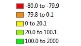
During the classification process and selection, quantile with 10 classes was chosen at first because it placed an equal number of values in each class, which distributes the population change in a better manage. Natural breaks was not possible because the data did not really have strong break points due to missing data from the early 20th century. Due to the high values being negative resulted in a biased map when the equal interval was attempted with low and high number of classes. Equal interval would portray a red counties when they had positive data values. Quantiles assured that each class would have equal values and increasing the number of classes provided more distribution of the negative values without creating a biased map for example a region heavily red because of counties grouped together based off of negative values only rather than dividing it further to portray a truthful result.
After going back to reclassify the breaks the higher the classes the better the chloropleth map it will be, but higher classes will not be as productive with graduated symbols, dot density or proportional symbols. After playing with the the classes and setting ranges manually the best way to portray the classes and breaks is 5 classes through a manual classification to represent percent change. As for the graduated symbols, proportional and dot density maps true values were used therefore 5 classes were still used, but with a different set of ranges.
The colors for the maps were chosen based off what was being presented and the ability to comprehend.
Colors Ramp Selection
Graduated Colors - red to green color ramp was chosen for these maps because the percent change for some decades have negative values and the red hue helps identify the counties with a negative value. As the color ramp transitions from red to yellow to green it represents growth in population, which can be easily understood by map viewers.
Graduated Symbols - A yellow hue was selected for the counties in North and South Dakota with red graduated sphere symbols. The red stands out and triggers the eye to examine the symbol. While examining the symbol the map viewer can see the changes the map is presenting.
Proportional - A steel blue was chosen for the counties while a tourmaline green was chosen for the symbols because the green color portrays the size of symbols clearly in the midst of the steel blue background. The blue background really shows the outline of each county and the green helps proportionally with the size of the symbol.

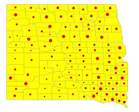
Dot Density - A dark blue was selected as the background in order to use yellow for the dots representing a value per dot. Yellow was chosen because having the dots around one another or far away presented in yellow mimics the view of lights seen from space down on Earth. The dots are better understood when seen as groups of yellow dots on a dark background and visualized as population density much like populated areas with lights on Earth.


 Dot Density - A dark blue was selected as the background in order to use yellow for the dots representing a value per dot. Yellow was chosen because having the dots around one another or far away presented in yellow mimics the view of lights seen from space down on Earth. The dots are better understood when seen as groups of yellow dots on a dark background and visualized as population density much like populated areas with lights on Earth.